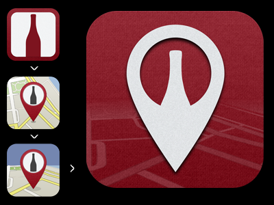
Wine icon evolution
Snapshots of the evolution of the icon for the wine recommendation app I'm developing. Ultimately tried to keep it visually simple and match the app's appearance and colors.
I had wanted to use a wine glass as a location marker, but just couldn't get that to look right. I think this still works pretty well.
(I really need to stop "sketching" in photoshop. It's like I'm afraid of a pencil or something.)
More by Curtis Herbert View profile
Like
