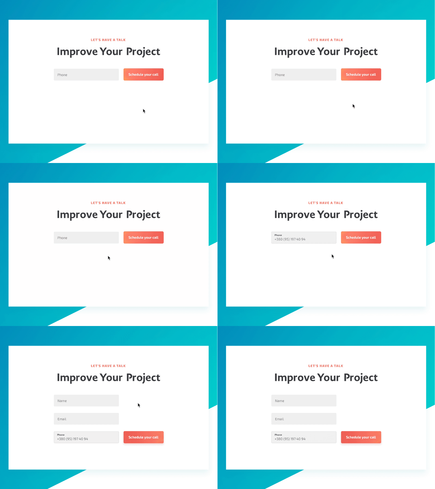
CTA form UX descr+ animation (Principle)
Hey guys! 👋 - full behance project
Have a lot cool stuff to share!
Shortly:
Sharing with you short presentation of UX flow through the animation. This is a CTA module from the landing page I'm working on that was improved from UI side and simplified from UX + content design.
The problem:
How often do you leaving a site or form when you see a lot of fields to fill? It happens to me a lot (when google or safari can't help 😂), so I decided to approach the visitor with one field and then show other ones.
I recalled the idea "start small - make big" and it works just perfectly with CTA form.
Ideally you should start from Name field, but it depends and better find out for sure using group A / B testing.
😈 Press "L" to show some love!
________
‼️Just started a brand new Design Channel where I'm gonna share my iPad + MacBook workflow, process, tips etc.
➡️ Stay Tuned (instagram)
