Script Refresh
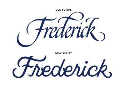
Working on updating the logo for the local Tourism Council. They wanted to retain some of the iconic features of the previous mark (like the F) but update the script to be more modern. One of the biggest issue with their old logo was the legibility. With the new mark, we eliminated those issues by beefing up the weight and spacing the letters further apart.
More by Cecile Madonna View profile
Like
