Lollypop Typography & Patterns

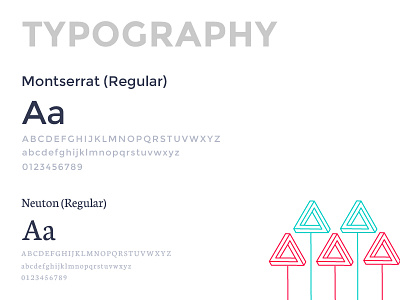


Typography is the king and speaks louder than words. We have introduced a combination of Sans Serif and Serif fonts; Montserrat and Neuton, respectively. We've incorporated Montserrat in beautiful, bold headings and Neuton has been used for paragraphs to allow for increased readability.
This time we have opted for Google fonts because of its great loading speed and ability to render well across platforms.
Coming to patterns, one of them is the Hexagon, which symbolizes harmony, balance and efficiency; it is arguably among the most sacred geometric symbols and is present in nature in abundance. The shape itself is an amalgamation of a circle and a polygon. It has the extensiveness of a circle, but also the definitive angles of a polygon.
For us, the hexagon is the balance that we bring between analytical thinking & emotion as well as technology & empathy. It mirrors the Lollypop pursuit of achieving design excellence by balancing the extremes of nature into one beautiful solution.
Another pattern we've introduced are triangles, which are symbolic of the Lollypop process- Discover, Define, Design. Like the sides of an equilateral triangle, each of the three steps weighs in equally as they work in harmony with one another to produce strong, creative designs.
Triangles also suggest movement and direction, which we can relate this to the journey of Lollypop- always learning and expanding. We aspire to progress, grow upwards and always shoot for the stars.
Check out our NEW website here: Lollypop Design Studio
Thank you.
Follow us for more shots.
Facebook|LinkedIn|Instagram|Medium