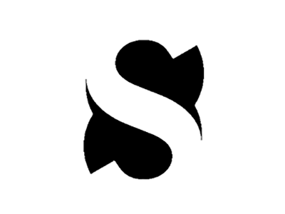
STRUBLE.design Logo
When designing my personal brand logo, I wanted to use positive and negative space to have the eye flip between a letter and an abstract form. When studying the shape of the letter S, I noticed a similar shape found in the number 8. I placed the shape of a black eight behind the white letter S and with some work, arrived at my logo.
More by Douglas Struble View profile
Like
