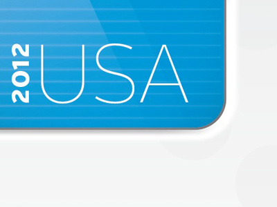
USA!!
Hey all, still trying got work out this type of style for a job, getting better but I'd love to hear any advice; I want it to be "richer", I find it's too pale although is supposed to be light, my attempts to up the contrast just muddied it up, heavy handed, subtly has been my biggest lesson so far... Also:
- Does the striped back round look too Apple G3? Not looking to take a step back here...
- Should there be a very slight hard shadow behind the letters? Almost appears to have one but there isn't really..
Thanks in advance! I appreciate all advice & critique... Cheers, Matt
More by Matt Macdonald View profile
Like
