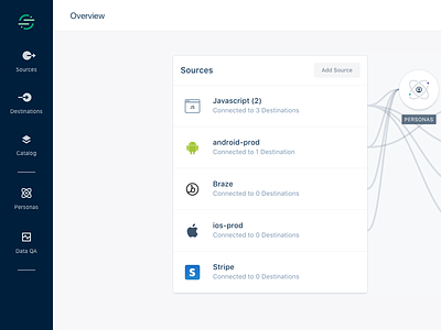
Navigation Redesign
In the spirit of current initiatives on human-centered enterprise design at Segment, we're rolling out a redesign of our app’s navigation!
The Challenges:
1. Ensure the navigation is scalable for new product areas
2. Make it easier to perform repeated tasks across different integrations’ (i.e. Sources or Destinations) pages
3. Improve users' orientation of where they are and how they got there, especially as they drill down into a Source (e.g. Android, iOS, Website) or a Destination (e.g. Google Analytics, Facebook Pixel)
The Design:
• Global Sidebar that houses the core platform as well as premium add-ons (solves challenge #1)
• Breadcrumb & Dropdowns (solves challenges #2 & #3)
Teamwork Makes the Dream Work: In addition to Design, Eng, and Product, this was a significant cross-functional effort across our amazing Success, PMM, and other teams. Also, shoutout to our customers who provided insights throughout user/beta testing! We appreciate you so much :)
Bonus reading: https://medium.com/segment-design/design-x-engineering-the-segment-apps-new-navigation-9ad36bcb7eca


