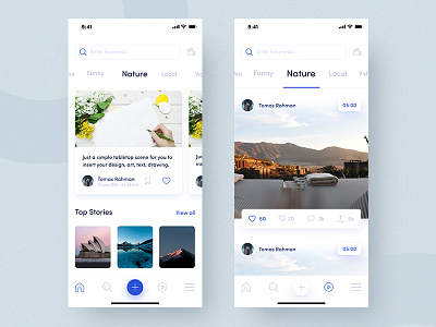
Topbuzz Application Design
Our goal:
-Better usability. Based on the browsing habits of the English native speaker, we are expecting new layouts that optimize the current information architecture as well as the content consuming experience.
-Better look. As long as the new UI look is acceptable to the majority, we want to combine new design trends with our product, therefore you can play with color schemes, fonts and impress us!
-Better localization. Besides designing interfaces, what we want to see is designing “culture”. We believe that you would have a better understanding of North America users and fulfill their potential emotional need, including but not limited to color preference, interaction habits, etc.
Design Solution
First of all home feed page design, The last design I see a lot of details you are input at a time in your pages, I know most of the users we are forcing the read the whole description at a time, That's why I m thinking to do give the users permission whatever he wants to do he can do easily. If you want to slide then he can do easily he doesn't need to swipe down. When One of the articles is reading is done then he can close it and see the next topics as well. I m taking some of the inspiration medium and some of the news apps like new york times design Because they handle a lot of content at a time how they are handling this situation.
Home video feed page Last time I see three videos at a time, If I do not clearly see one of video then I m not play any video. That's why I m making large video users not confuse whatever he wants to play he can play without any confuse he can see easily whatever he see right now. Another thing if users double-click the video then automatically love added the video post. I'm trying to optimize your content as well.
Article landing page most of the users are hated the reading whole things at a time, because of boring stuff they are love to see some new things. My goal is not making boring stuff make the long page little bit interesting users love to read the whole things not a time. He can see next details as he wants to read it not forcing to read the whole article at a time that's why I m using some of the micro-interaction concepts. Then as per your some of the details like include article content, related article recommendations, comment field & comments display part;
Video details Page my concern is when coming to this screen if user click the play icon that time card is little bit fade and down then comes to the video screen If the author has other videos (like a playlist), you can go to the previous video by clicking the video on the left (on the background). Same interaction for the next video.
Most of the time user hate the advertisements if the add like of that then users don't hate this because of better usability as well as easy to use. This page mainly making this following goal include the video player, related video recommendations, comment field & comments display part;
usability tests, designers, analytics to make the interface become better and better. I am not saying it is better, and I didn’t include all aspects. It's just like concept parts. You can still come up with your ideas, even if it is not going to be a real idea, you can give your inspiration that should change big impact.
So let me know your thought
Thanks
Joy
Follow me


