Gréduk Creative - Logo Concept
I was challenged to develop a full, well-rounded brand for a creative agency. The company is named Gréduk (pronounced "grey duck") because of it's deep Minnesota roots; the game "duck, duck, goose" is lovingly (and correctly) called "duck, duck, grey duck" in the northern state.
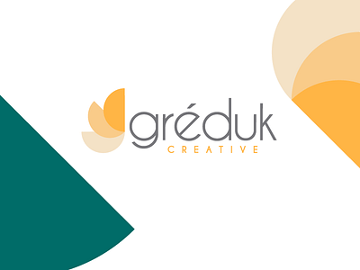
To play off the name, I created a logo that features an abstract design that represent wings of a duck when flying. The geometric sans serif typeface was selected because of the relation it has with the half circle shapes used throughout the branding. Minnesota summers were also used as inspiration for this branding; you can see it in the complementary color palette of oranges and greens which echo sunsets at the cabin surrounded by pine trees.
