Zikzak Architecture branding
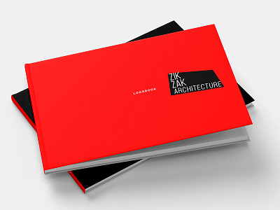


Together with BrandPull agency we designer logotype and logobook for architecture company. The main semantic message of this branding is the red area around the logotype. It symbolizes the metamorphosis of forms in construction and can be modified from case to case
For more - on my behance
Thank you!