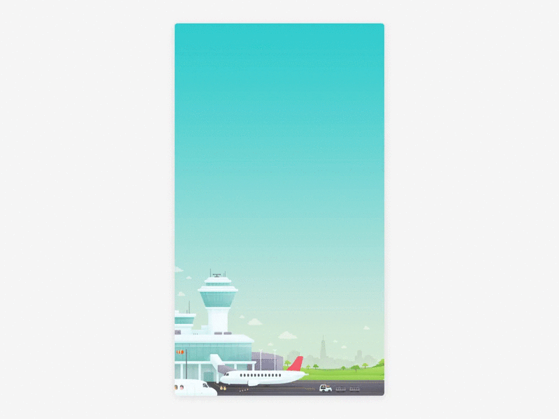
Split Search Screen Landscape
Wooooo, the search screen has been updated in the app!
We're still finessing the UI, but it's current form addresses some known usability issues, now that there are two products within the app — flights and hotels. To help reinforce that they're completely seperate products, this new background illustration changes to a different time of day, and area to reflect the product, as the user taps back and forth between the two.
Check it out in the app now, and have a gander at the attachments to see the full day and night states.
More by Hopper View profile
Like


