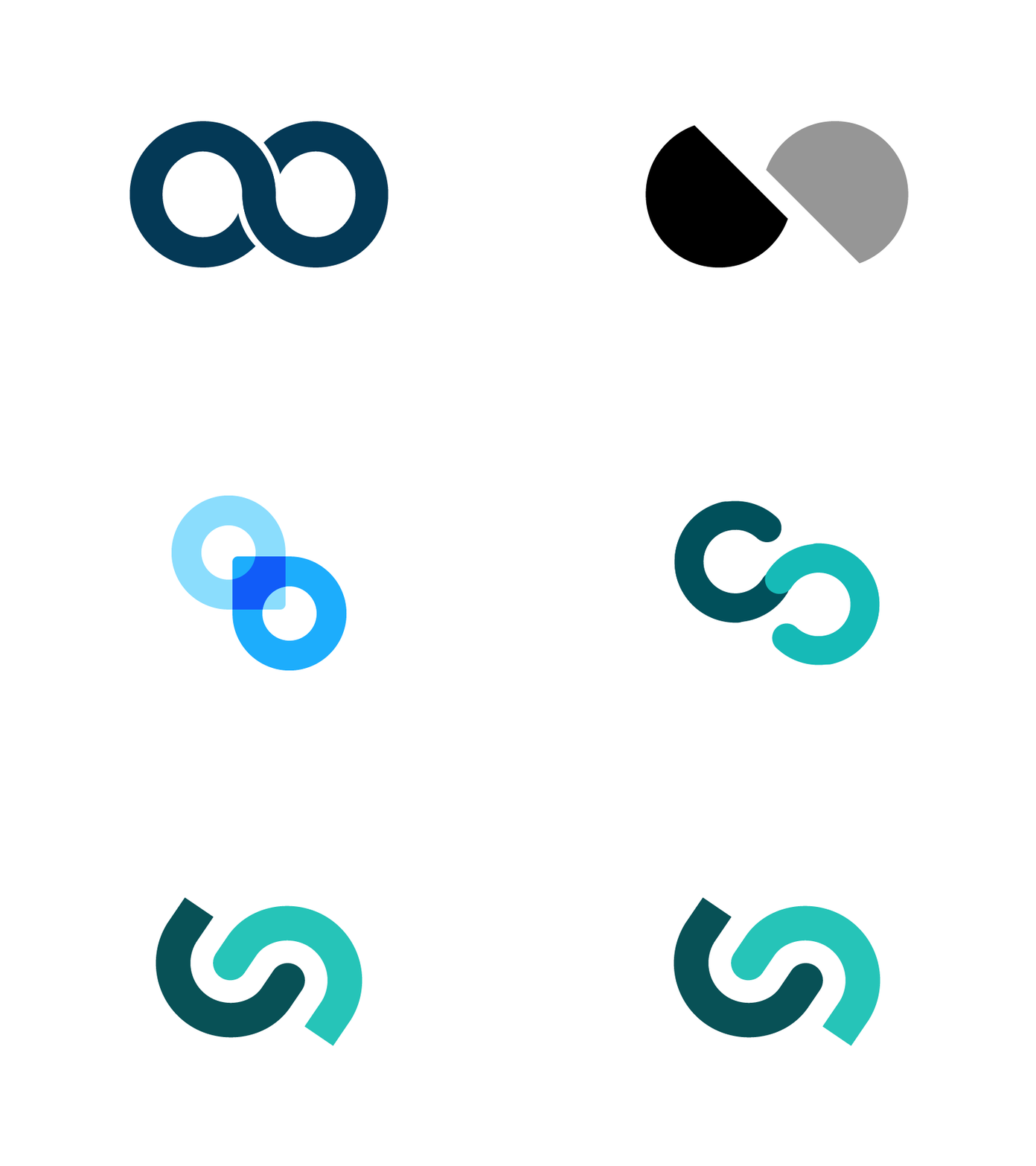
logo exploration
We recently launched our new brand (which we’re very excited about!) and wanted to show a bit of the exploration that went into it. Our goal was to evolve our old brand, rather than completely leaving it behind, so we spent a lot of time exploring different elements we could move forward. The evolution of our old logo’s infinity mark into an abstracted handshake ended up being the right direction, as it highlighted the importance of partnership in our company.
Our colours too ended up being an evolution - our blue turned to a forest green, and our gold turned to a sunset orange. They are now closer to our demo service, allygator, and they’re also just flippin’ good fun to use!
The entire rebrand was done alongside @Emmeline Meborn-Hubbard @Allegra Parlavecchio and Vincent (our star Head of Design) - it was a joy to work with a group of such lovely and talented people! Couldn't ask for a better team :)
