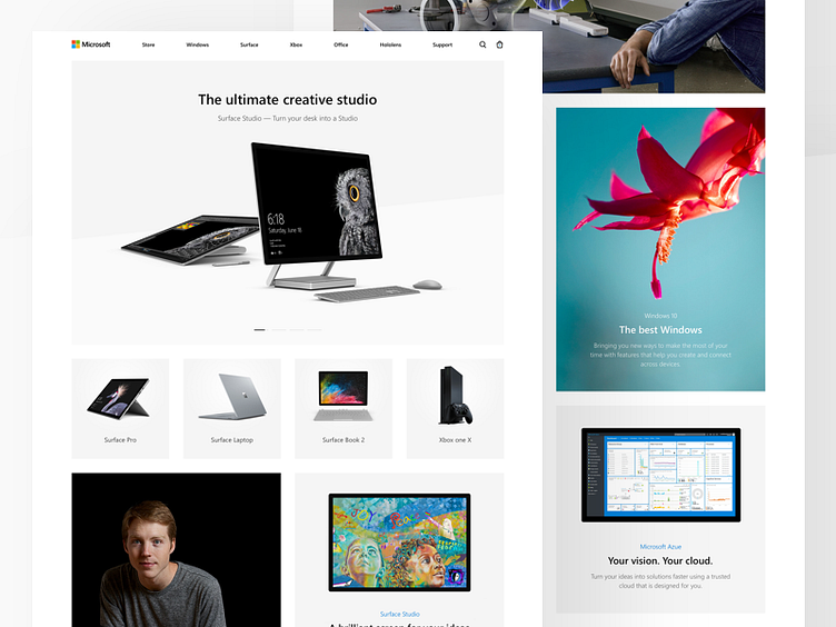
Microsoft: Home page
Hey guys! 🤠
I know that many designers switched to OS X due to the fact that they pay more attention to the details, interface, colors, icons, shadows and general UX logic.
But with the new Fluent Design System from Microsoft, I'm sure they will be able to change the course of things, and I'm with my team a big fan of Fluent System. So, we decided to create a new website for a top product of Microsoft family with eyes set on Fluent Design and new UX.
Special thanks to the amazing team who worked with me on this concept: @Alex Pesenka and @ALEXEY FMNH, you are amazing guys! 🤟
Renders and photos - Microsoft Device Design Team.
┈┈┈┈┈
Flatstudio · Instagram · Facebook · Twitter
P.S. Follow us & Like [L] this shot to share the love! 😍
More by Flatstudio View profile
Like
