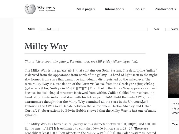
Rethinking the Wikipedia article page
For this design exercise I prioritised spacing to make the article easier and more pleasurable to read. I took some "creative liberties" with the logo to make the navbar more compact. 😉 Speaking of the navbar... I'm still not 100% happy with it so if you have any suggestions feel free to write them in the comments. :)
More by João Arruda View profile
Like
