Google Play Store - Material 2.0 | Day 191/365 - Project365
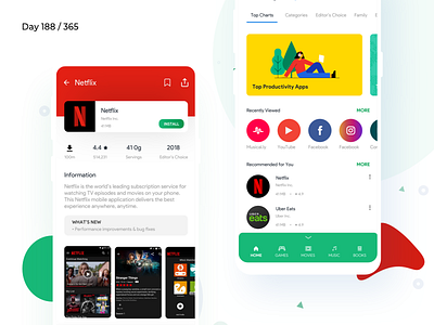
Day 191/365 - Google Play Store Mobile Redesign Concept
For Redesign Tuesdays, I usually would incline to redesign interfaces that I have been using regularly.
Here's my take on the Messy Google Play store.
My approach was to tidy up the complicated, multi-level navigation system. Make simpler sections on the bottom as a menu, customizable according to user needs.
All apps would have standard icon sizes, instead of anything.
Also, a lot of action does happen on the bottom, owing to the new Material Design language by Google 2018.
Let me know what you think of this one!
What is Project365?
Visit Project365.design
More by Kishore View profile
Like

