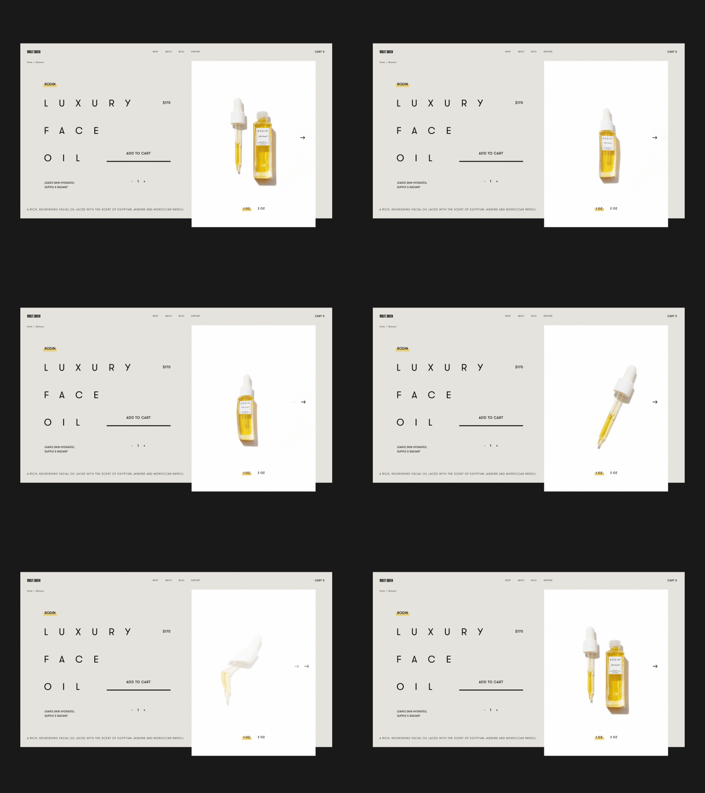
Violet Green Product Details Page Animation
What’s up?
Glad to share with you my take on another interesting project that is a luxury e-shop selling natural beauty products. The key idea behind the design was to make it feel high-end and refined. The particular focus was also made on the imagery and white space usage. The animation is done in a manner that supports overall design concept.
Eager to hear how do you like this one, friends!
Stay tuned for further shots on this project from me :)
Cheers!
Press "L" to appreciate it
More by Synchronized View profile
Like
