Lettering
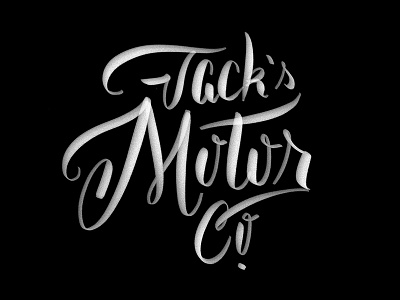
Pretty wonky attempt, but there's a nugget of okayness in there.
Think if extend the "M" downward & the "Co." to the right it might help? Any thoughts from letter-ninjas welcome.
Pretty wonky attempt, but there's a nugget of okayness in there.
Think if extend the "M" downward & the "Co." to the right it might help? Any thoughts from letter-ninjas welcome.
