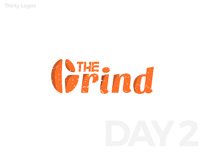
Thirty Logos #2 : The Grind
Day 2 of the thirty days!
#ThirtyLogos
This logo is for a small coffee shop in Seattle. One specific request from them was to make the logo stand out from other coffee shop logos which included not using the brown color.
I have tried to keep the letter G in the shape of a coffee bean, whilst affecting the legibility to the least. The grunge effect applied gives vintage and organic feel, while the orange color gives energetic feeling, which goes along with the motion-like font.
What do you think?
You can learn more about Thirty Logos challenge here!
____________________
Thank you for viewing my work!
Press 'L' to show love!
Contact me through mail