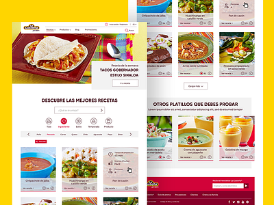
Recipe Website UI Design
This was an exercise in which we wanted to improve the UI Design for the actual "La Costeña" website. First of all we needed to remove the clutter which was mainly caused by the strong colors used in the original design, so we went for a really light and clean UI, using the brand's main color only on details such as selected button instances, lines and the website's footer. Second of all, we needed to redesign the recipe page, in which the user can search freely for the desired dish, and so after several wireframes and user tests, we came up with a much simpliffied visual arrangement with well categorized recipes by ingredient, type, course, etc.
More by Paulina Corona View profile
Like

