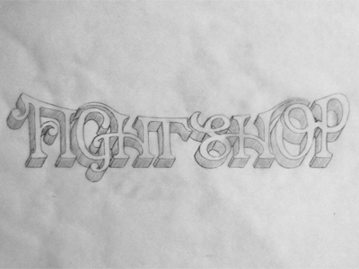
Fight Shop 2
Here's the other approach to this logo. A tad rough, and the dimension was kind of an afterthought, so not sure if that would stay, but just playing around.
Thoughts on this alone and/or in light of the other version?
More by Ryan Hamrick View profile
Like

