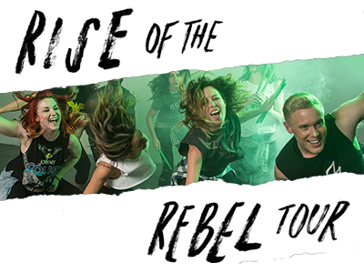
Rise of the Rebel Banner for POUND. Rockout. Workout.
Look + Feel branding for POUND. Rockout. Workout's annual Summer Tour campaign. The 2017 theme was "Rise of the Rebel." I hand drew custom lettering and used ripped paper elements to create a grungier feel. They had taken some awesome photos with green smoke bombs so we used those to highlight the campaign imagery. This is an example of a banner used on Facebook or the landing page for the site.
More by Rachel of PROCESS/PROGRESS View profile
Like
