Hiristic - Signup UX
Hi there,
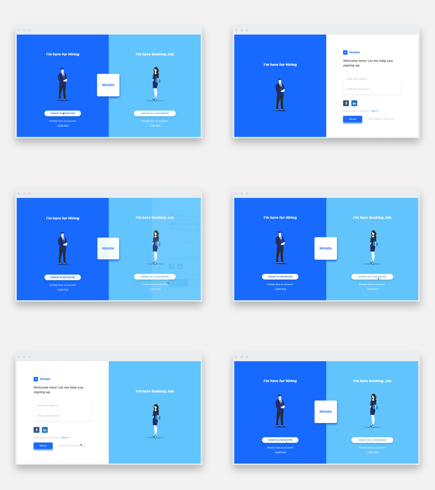
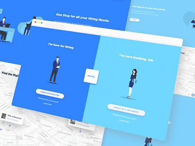
I've been working on a very new UX for web page signup.
Interesting Fact:
When you know your audience and both are equally important so why not give them equal attention to the product. Here is why I try to create a role selection for the signup screen.
What's new in the UX:
The user doesn't have to go through any role selection like who are you "hiring manager" or "seeker". You select your role and we only show you content tailored for you. This will give your product a new way to see the bounce rates and other things.
Now you tell me how you like this product.
Do follow me see more interesting stuff like this.
Behance | Facebook | Twitter | Instagram
More by Vikas Raj Yadav View profile
Like


