Mobile Navigation Explorations for Netflix
Happy Friday, friends!
We're working with our friends at Netflix on a product that will require navigating a complex hierarchy of content (note: this is currently sample content). We're hoping to build a solution that exposes the content clearly while still being simple to use.
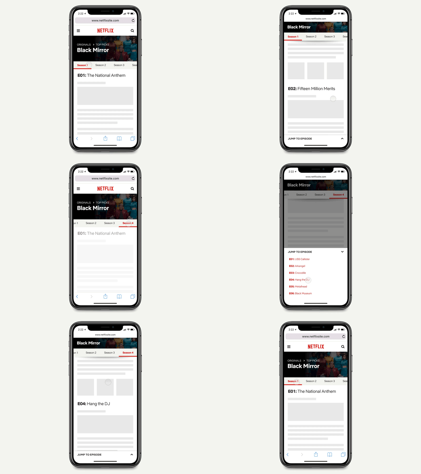
In this shot we're exploring how we might include multiple levels of navigation on a page that's already three levels deep (parent = Originals, category = Top Picks, page = Black Mirror). In this case, we're using both hscroll tabs (for seasons), and a jump navigation (for episodes). We're particularly hoping the jump nav within the page could work well – something we'll be validating in the next few days.
If you've seen other nav patterns similar to this, we'd love to see them! You can also check out a larger video.
Made with Underbelly
We are taking on new projects. If you think we can help you, get in touch at hello@underbelly.is
We are always looking for new and talented individuals. If you think you’re a good fit, check out our open positions at http://underbelly.is/hiring
