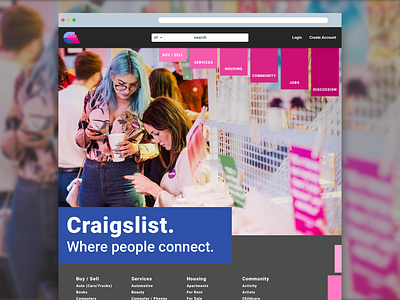
Craigslist Redesign
After finally landing on a logo that I feel comfortable with, I decided to go forward with redesigning the Craigslist front-page. I went with a darker theme and pulled the pinks and blues from the logo for the page. Apple said about the dark mode that they're (finally) creating that the darker UI will allow for your work to stand out more, and I feel there's a bit of truth in that. Sure, I love a good dark UI like the next person, but I do feel that it helps create contrast and allow for the work/product to stand out, so that's why I went with a darker theme for Craigslist. You can't see it in action where it would be put to the best use, with the products, on here, but I will probably explore that next.
Thoughts?
More by Shane McKnight View profile
Like

