ApplePay Redesigned
Hello,
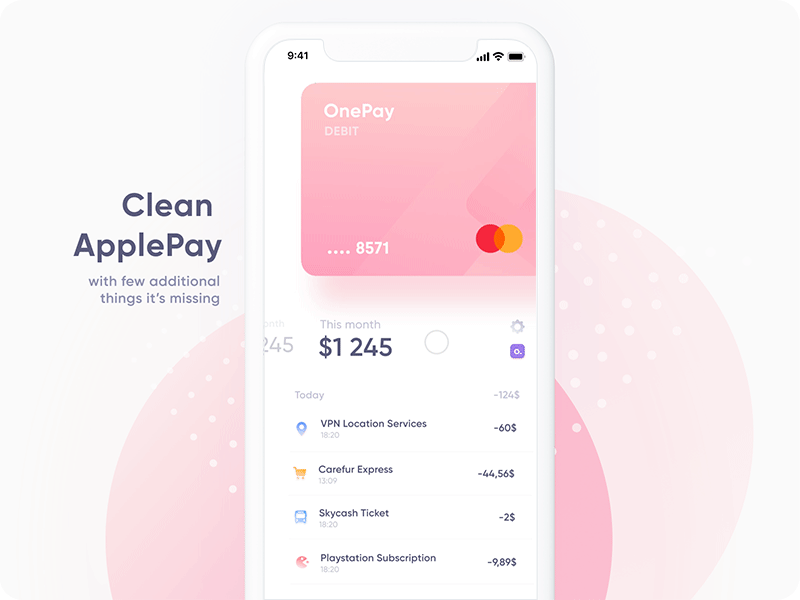
Recently Apple Pay became finally available in Poland, ridiculous that it took that long, I know :P But I felt that it is missing some basic elements right up front, like your summary monthly spendings + transaction history. So I figured out that it might be a nice idea to design something bit fresh for the whole Apple Wallet with different style, just to have fun.
Designed in Figma, just to try it out. Animations by amazing @Bernadetta Pastuszka
Cheers!
Ps. It seems I forgot to fix the way amount's are displayed and one of them only has two spaces after comma so next time I will fix that.
More by Michal Sambora View profile
Like


