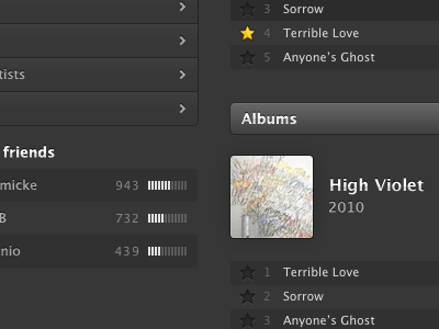
Spotify – full desktop redesign
Still nothing official, this is just for fun.
Anyway, started from the wireframe from last week, but toned it down a notch, feature-wise. So this is basically a redesign of the Spotify framework, with a new angle on the artist pages. More personal, more inspiring and a bit more social. And oh, the left nav bar fades in with colored app icons when hovering it, and fades out to b/w when not hovering, just to keep you undistracted.
Good and fun practice, would enjoy designing for OS X more.
More by Viktor Engborg View profile
Like

