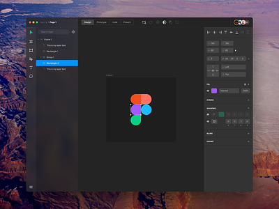
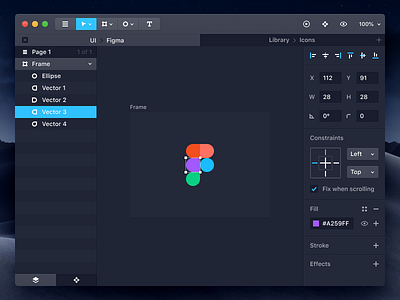
Figma Redesign
Design a designing app – this is something I’ve always wanted to do and for few reasons I think this is perfect moment:
1. I have some spare time currently so I work on few side projects to not forget how to design stuff and move pixels around :).
2. I’ve recently got back to @Figma and after a while of using it I came up with small UI/UX improvement which would probably save me few clicks. This made me think it would be nice to spend a bit more time on playing with Figma’s UI.
3. I’ve been working on this design for couple nights. I didn’t pay too much attention to details until I saw this by @Benjamin De Cock – who is my absolute design hero I have always admired.
So I thought it’s a good moment and opportunity to give it a shot (rebound?).
It’s not perfect, there’s probably many things I forgot or didn't think about. I also don’t want to undermine current Figma – it’s absolutely great and I know from own experience that sometimes you need compromises when you’re building such a complex tool used by so many people. So kudos to Figma’s product team – keep doing great work and consider my design as a tribute.

