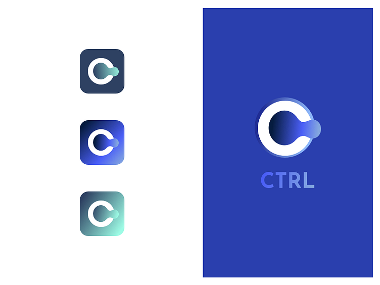
Ctrl Brand Identity
Working in a very niche industry, for very specific users, building a very complex interface but having a cliche name + logo... can't be like that, right? They deserve better, right?
Tried to build from the "power button", and left the name as is. About both the product owners are very emotional. And that's alright, they own it.
Played with the shape and came up with a fluid logo, clear typo and a bit too much of gradients, I know. Behaves well on almost any colour, and any material. Practical, usable, and a bit less of a cliche. I hope.
My last footprint before I leave. Should it be it?
More by Maruša Novak View profile
Like
