🏷 Making card in 20 minutes
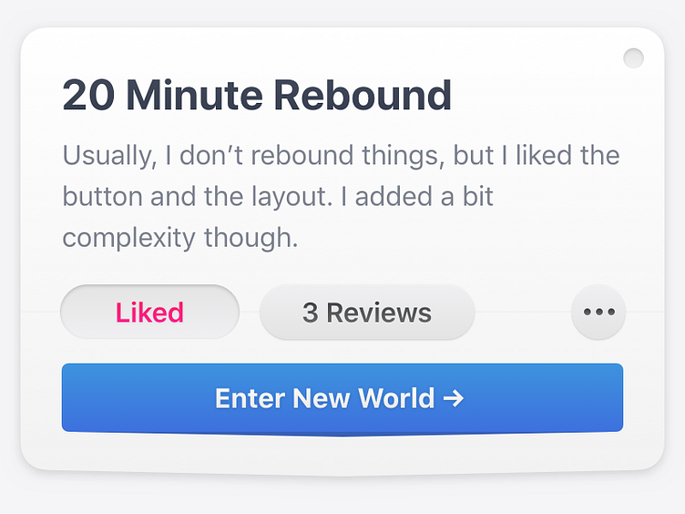
I like depth. Still, I have troubles to use inner and drop shadows properly. Who has bullet proof techniques to reach proper visualization of depth?
I'm using small gradient on text and buttons (making top color lighter and slightly different Hue), multiple 0.5 shadows with combination of ⬜️ and ⬛️ and 0.2 borders (hardly seen on dribbble).