No Gradient Logo Mark
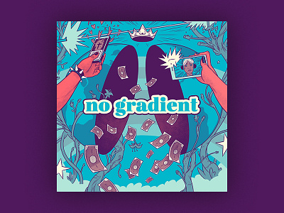
Along with creating the header illustration for No Gradient we also needed to come up with a logo mark for the podcast and blog when shrunken down in scale or for social avatars.
The client wanted the logo to simply be the two letters N and G. After trying dozens of different typographic styles and weights we landed on this direction. It had a professional classy feel like a newspaper while also capturing a playfulness with the use of color and italics.
I feel this combination captures the spirit of No Gradient. The topics will be real and the talks will be deep, but ultimately it's a a safe atmosphere and one that should be seen as open and welcoming to discussion, questioning and learning.