Youngs Business Cards
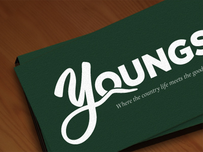
This logo has evolved quite a bit since the last shot. It seems to play nicely as a business card.
The client wanted a sans for the 'oungs' part. And thanks to some good advice here, I've spent some more time considering the font for the tag line. In the end I'm loving the softness of this italicized serif.