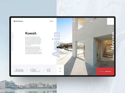
Rent House Website
Meet our new Dribbble shot! It's rent house platform.
We decided to rethink classical rent website's design. We use big photos and make accent on big bold typography. Also we use our custom grid to make our design more unique. In this design we use "square block system" design it came from brand identity and we keep this consistency.
Our design remains invisible and brings to the first place houses' photos and information about it.
We believe that this is best solution for this websites category, isn't it?
Looking for creative design solutions? We would like to help you! Email us — info@obys.agency
More by Obys View profile
Like

