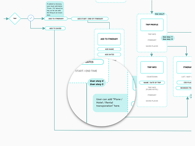
Sitemap
Recently a client contacted us to make a redesign of their product by re-evaluating the changes they wanted to make and add some new features.
After the product was launched (few years back) the team found out based on feedback and user interviews that adding those features is a key-point for their future development.
So the main task was to add a "Trip profile" and "Itinerary", completely new elements in the user flow.
The client provided some user stories and wireframes.
The problem was that there was no logic and connection between both, so I came up with the solution of making a simple sitemap. While noting all the new features and user stories as part of the flow the client was able to review and understand the changes that came up after our initial kick-off.
**Of course a small interaction was to use the product color, so the whole sitemap can be a bit more appealing and not yet just another diagram document.
---
Like it? Press "L".
Looking to create a digital product - email us at contact@despark.com
Our website / Medium / Twitter

