Apartment Card | Data Driven Design
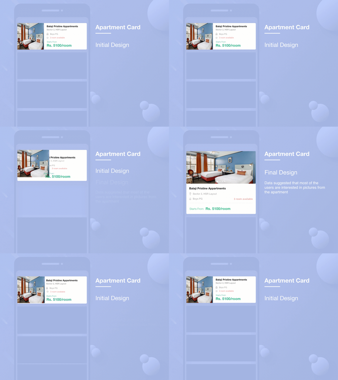
Designed a card for apartment/room details for some internship assignment. I assumed that user might get irritated by long scrolls, So I kept the height of card less, accommodating multiple cards on the same screen.
Later during the interview based on the exercise, I was told that my assumption was wrong and data reflects that user has do multiple scrolls with no issue and most of the users are very much interested in the pictures from the apartment/room.
So, I designed a new card knowing the user behavior and added multiple images using a carousel and also increased the size of the image.
Hope you like it
Please leave your feedback
More by Kunal Satpal View profile
Like


