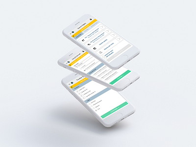
Expedia — Flight Selection and Search
Part of one of the first product design exercises given to me last year for a product/communications design interview at Uber. Didn't really feel my skill set was really there prior to applying to this company (*Not affiliated with Expedia) but applied anyways and to my surprise got an e-mail to complete a design exercise, and made it to final interview round!
This experience really opened my eyes to the world of product design. I'm proud of what I accomplished in less than a week and really glad I pushed myself to learn something outside of school.
—
The exercise challenged me to re-design the mobile user experience redesign for choosing flight dates or focus on the user interface redesign of the search interface (I decided to tackle a bit of both).
My submission is uploaded on my website on a PDF doc, feel free to browse through: https://samanthamtu.com/
—
It's been a year since this experience and now I totally would re-do this a bit differently. I'm hoping to upload an updated case study on my portfolio website. Stay tuned!
