Cover Comparisons
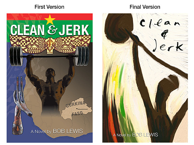
The client wanted to incorporate significant story objects on the cover—an obvious choice. There was an image of the main character, a weightlifter, and the primitive masks his family carved, and the map of Burkina Faso. After juggling the individual elements around, it didn't capture the feel of the book.
Early one morning I had the idea to go in a different direction, more visceral and stronger, with thick paint and a palette knife to capture the power and emotion without being so literal.
