Recipes Dribbble
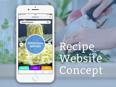


I decided to create a concept for a recipe website. I'm no professional cook by any means, but my wife and I cook enough that we look up recipes online a lot and use our phones to read them while we cook. The most annoying thing I often run into is that so many recipes that we find online are preceded by a super long blog post. I have to scroll for what feels like a mile just to get to the recipe. And that's just while we're deciding what recipe to use, so we have to do that multiple times, not to mention when we actually want to use the recipe.
To fix this, I stripped down a recipe that I found online* (a really good one, by the way, you should try it) into three sections: ingredients, steps, and notes. Then I made tabs for those sections and kept them at the bottom, in close thumb reach. My thought behind this was that if you are cooking and using your phone to read a recipe, sometimes you need to switch between the steps and ingredients to double check something. With tabs at the bottom, you can flip back and forth with one touch instead of having to scroll a lot to find what you're looking for.
Another goal I had was to try to fit as much information from a section onto the screen at once to minimize scrolling when you switch between tabs.
The actual information screens are pretty minimal, and could possibly use a bit more of a facelift, but I wanted to keep the focus on the content and the UI of the tabs.
I made this as a website as opposed to an app since I feel like more people go to the web for recipes rather than an app, but this could easily be adapted into an app form, maybe with methods for inputing your own recipes or pull them from websites.
Any thoughts or ideas on how I could improve it?
*Here's the recipe that I used:
http://www.aspiringsmalltowngirl.com/2016/12/best-fettuccine-alfredo/
