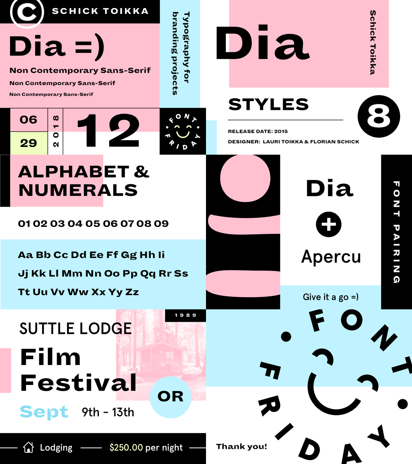
Font Friday 12
What's up, everyone? Happy Font Friday! Hope you smashed those projects this week! 🚀
This week on Font Friday, I'm featuring Dia by Schick & Toikka. Super fun and stylish font! I could see this being used for conference branding or a blog.
Dia is a family that captures the diverse spirit of those early Grots while distilling them into a concise and cohesive family that functions as well for text as it does for display copy. Unlike Modernist type systems, Dia’s four weights (with accompanying italics) don’t adhere to a uniform pattern. Instead, they each celebrate the distinctive formal aspects of various historical models, from light and narrow with curling terminals, to heavy and broad with ends that point outward.
FONT PAIRING 🙌
-
Dia + Apercu
I've been really enjoying putting together these Font Friday's! If you are liking them, let me know in the comments below and smash that like button!
Much love everyone! Have a great weekend - get out there and explore ⛰🏕☀️


