Icons for a New Global Telecommunications Website
Hey there!
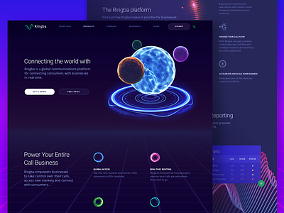
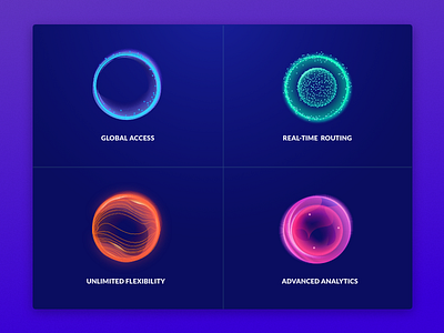
This is a follow-up set of illustrations I created for Ringba, a global telecommunications platform we are making a website for here at Zajno.These icons are designed in a bit different style from the ones I shared with you last time, as they represent the 4 main Ringba’s benefits, and so they should stand out.
Goals
Designing icons that would fit in with our abstract and metaphorical design and at the same time illustrate processes of mainly non-material nature. That was pretty challenging considering the number of icons necessary for the website!
Approach
As @Sasha Turischev has already told you in the description to his latest shots, we chose to present the product through a metaphor where the big shiny orb represents Ringba and its satellites are Ringba’s add-on products. Considering this, the decision was made not to reinvent the wheel and use spheres, orbs and waves as key elements for creating icons. All the icons will soon be animated to better illustrate the essence of each process and feature they represent.
Results
We came up with a set of metaphorical, futuristic icons that adhere to the website’s overall style and easily communicate the concept being represented.
Wonder what you think of these. Do let me know!
Press "L" to show some love!
ᗈ Join our Newsletter!
ᗈ Website
ᗈ TheGrid
ᗈ Spotify
ᗈ Twitter
ᗈ Medium
ᗈ Facebook
ᗈ Instagram