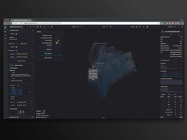
Graphistry UI
I hear a lot of design methodology preach over-simplicity & mobile-first approaches to good software UX, idealizing that user tasks should be optimized in succinct, repeatable paths, which is widely applicable to consumer applications, but what about the rest of the software world? As a product designer who works primarily on interactive workspaces that often combine dozens of micro-products into one environment, I spend a lot of time challenging that theory, testing and deciding where to apply simplification and where to promote a more exploration-first design methodology that strives to put the user at the helm, empower them in the best ways possible, and then step aside. At the end of the day the UX design process is the same, our solutions stemming from the users of these tools, but it is interesting to hear from data scientists, analysts and security experts that many of the modern "well designed" products make them feel "boxed in" or forced down less creative paths of accomplishing their job.
In my own world I liken this to the design of products like adobe and sketch, wherein a learning curve exists, but provides creative professionals a chance to become masters of their own domain, suggesting that possibly, there is room for highly dimensional, "busy" solutions in good software.
