Cole Sager Logo

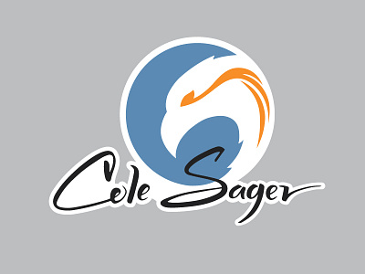
Cole Sager is a personal trainer specializing in cross-fit and is ranked 5th nationally in cross-fit games competition. Consulting with him personally we narrowed what he wanted to represent his branding. He wanted something simple, clean-cut, trustworthy, powerful, passionate and stated “something powerful yet graceful”. In the early stages of conceiving I felt an eagle represented those qualities well and showed him some thumbnails he loved. The color palette was chosen to exemplify these characteristics also, orange being powerful and passionate, and blue counter-acting to create balance with grace. I also took his signature and transcribed it in a hand-lettered style. There is subtle C and S within the logo, the c in the blue and the s in the white space having the “fire in the eye” completing it. Simple, clean-cut, powerful, graceful.