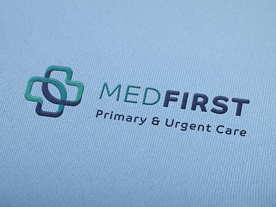
Med First Logo
Mockup of Med First Primary & Urgent Care logo on scrubs. Med First is a primary and urgent care center with over 30 locations across the Southeast. Their branding was outdated and their logo was difficult to read, and they wanted to revolutionize their image in a way that would appeal to their primary audience of primarily rural, older people across the Southeast. Inspired by coastal colors, the logo mark represents the unity of the two different sides of their hybrid business model; namely, primary care and urgent care. The final delivery included a new logo, style guide, and set of branded print collateral including business cards, brochures, posters, vinyl decals, billboard, and building signage.
More by Katie Birmingham Corbett View profile
Like


