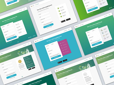
10 shades of signup
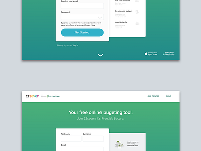
This was a sign up screen specific for users that came via 22seven's parent company Old Mutual. Just a fun experiment on UI layout and colour variation... A look into how one brand could have multiple interpretations.
*P.S. I just noticed spelling on "bugeting" which should of course be "budgeting". Installing spellcheck sketch plugin now ;-)
More by Marisa Breedt View profile
Like


