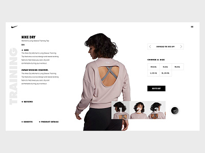
Nike Product Page Concept
Nike has a good website overall so I wanted to keep ux in mind. I could have of course used a bunch of colors to make things pop, or go crazy with the design but I felt as though that wasnt nike.
I decided to make everything around the product sort of be there while the product is front and center so that the customer is basically immersed in the product while everything else fades out.
I think this is a possible look that nike will have in the future but who knows really haha.
Constructive criticism is always welcome!
Also life's going well saving up for design school in New York then I get to do my passion all the time. Until then I'll be on and off haha.
More by Stalone Sylvestre View profile
Like
