Ten Forward Style Tiles
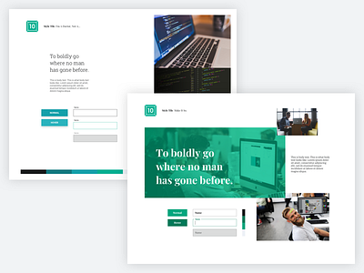
I created these two style tile concepts to pitch a redesign of Ten Forward Consulting's website. I wanted to pay homage to the company's Star Trekian lineage. In the first option - titled "Make It So" - I used a tight color palette with big, personable imagery. I created it to better convey the office culture as a way to virtually introduce users to the team. The second option - "I'm A Doctor" - relies more on technical imagery. It's less personal and more technical, used to convey the team's experience and knowledge.
More by Jared Christman View profile
Like


