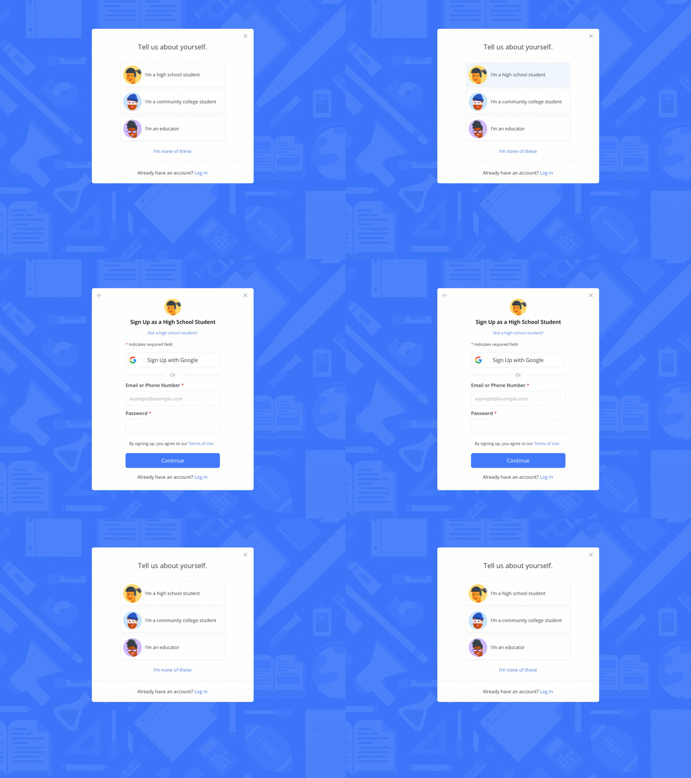
User-Type Avatars
✨Community college students can soon sign up for www.raise.me to earn micro-scholarships toward 4-year universities! ✨
The goal of this project was to add community college students to our sign-up modal. Before it was handed to me, the project was scoped as simply adding another radio button to toggle to a third user type at the top of the sign-up form.
I saw this as an opportunity to reduce confusion regarding who RaiseMe serves and the account type being created. Through some iteration and exploration, I decided that adding a separate user selection modal (not simply another radio button item) would reduce the user's cognitive overload and provide clarity around which account type is being signed up for. Previously, the sign-up modal defaulted to a high school student account which was sometimes overlooked—resulting in some educators creating student accounts. By having the user take an action to select their user type before they are presented with the form, users can be more easily sign up for their desired account type. Not only this, but I saw adding avatars as a chance to humanize the sign-up modal and add some brand personality to the first time user experience. 💪
Stay tuned—this feature is currently being built by one of our lovely engineers and will be launching in a few weeks.

