Keystone 0.1
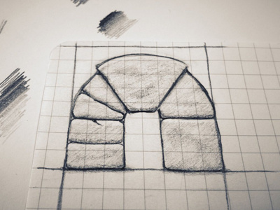
I am sketching an icon to accompany a logo for Keystone. Looking for some feedback on this direction.
Additionally, I can't decide between the left side style of stones, vs right side (more vs fewer). Let me know your opinions please. Thanks
Update: Alpha Invite Request
More by Alex Parker ⇢ ☁ View profile
Like
