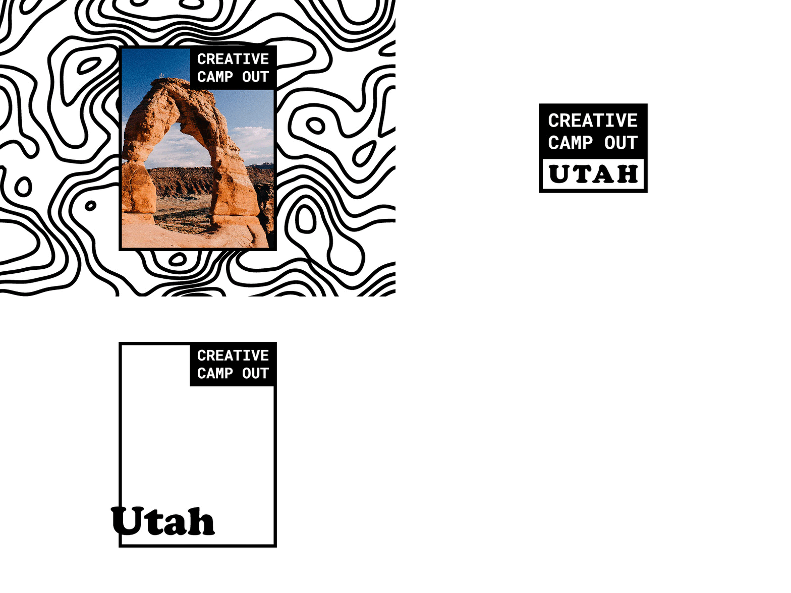
Quick logo for a bud
@Zac Nielson is throwing together a little design camping event here in Utah so I thought it'd be fun to throw together a quick identity. Nothing too radical but still pretty fun. The logo mark can expand into a frame so we can layer imagery. On top of that I thought it was nice that the expanded mark mimics the shape of Utah.
More by Scott Jones View profile
Like
