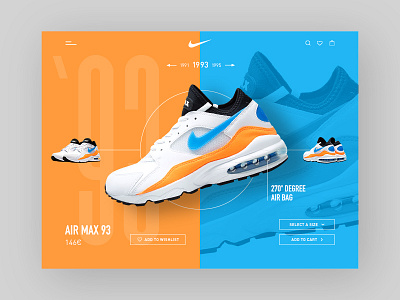
AIR MAX 93 - product details page
Hi everyone, I’d like to share with you my TimeNike, a series of digital creative compositions about the evolution of the Air Max Nike shoes.
The first one is dedicated to Air Max 93.
I designed a detail product page starting from splitting the area in two equal parts. I stressed the use of the main colors of the shoe in order to make the shoe pops out in a coherent environment.
To me ’93 means 80’s so I decided to play a lot with colors and reduce to minimum the use of photos. The functional elements are placed in a sort of rational path starting from menu to gallery to CTA in order to guide users to the checkout process.
More by Marco Quarta View profile
Services by Marco Quarta
Like

