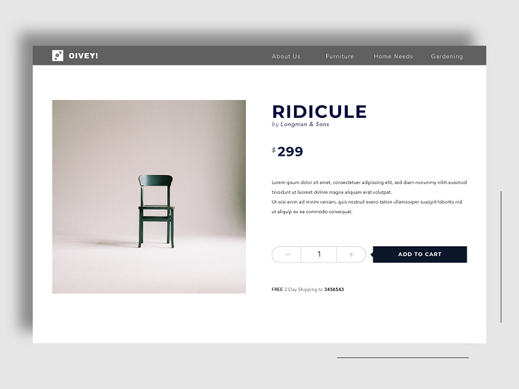
Product Page for Home Furnishing Store
Product Page Design.
I recently started working with an initiative where the primary colors to be used are dark and light metallic shades. These choices pose a unique challenge for me.
This is going to be a long learning phase for me, figuring out the relationships between different color and contrast combinations.
This is the first of many many more muted metallic UI Designs coming ahead.
Rajat Mehra.
More by Rajat M View profile
Like
